UI-UX Strategy
01
Make Everything the User Needs Readily Accessible
Whether it’s a series of design tools for web design apps, the inventory for a character in a video game, a spreadsheet, or anything else, if the user can’t find what they want, they bounce off your software. Tabs make things accessible. Shortcuts and hover tooltips, too.
We chose to use tabs to organize Divi, for instance. All the tools you need are right there in the builder, separated by category. Toolbars are similarly accessible. If you use WordPress, the admin toolbar gives you the ability to quickly get to the post editor, the theme customizer, plugin settings, and so on. The options are clearly labeled, and you don’t have to search them out.
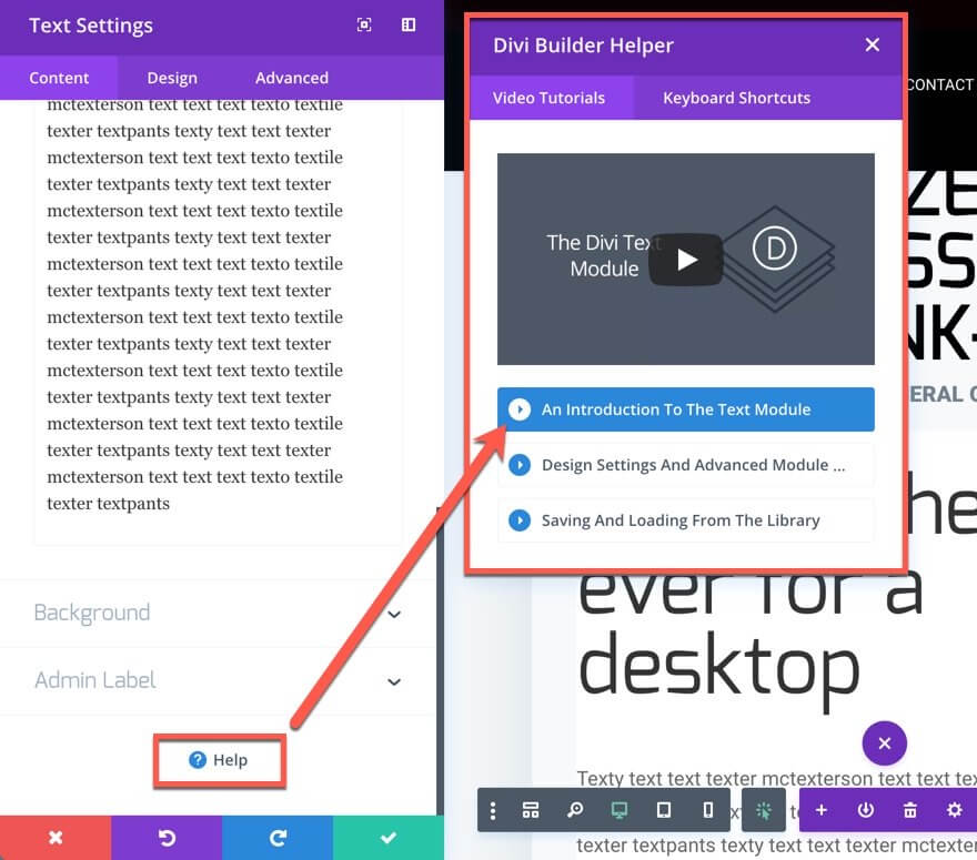
Another example is the Help/Support/Contact options. When designing a UI, whether it’s for a mobile app, web apps, WordPress websites, or anything else, your users will always need to find the Help button (or the Contact Support button). They will absolutely need to contact you at some point. That’s why you must always be sure to put the help buttons front-and-center. Look at Divi. In every module, we have the support button ready for you, at your fingertips, whenever you need it.
On top of that, the help window pops up with a video tutorial on whatever feature you’re working with. By including this in-module, Divi becomes far more accessible and less frustrating. Plus, as a part of the UI, the location for help is consistent across the entire product. Which brings us to the next point…
02
Be Consistent
Like we said just a moment ago, being consistent in feature placement within your UI is important. But you should also be concerned that your UI works and looks consistent across the entire product, too. Don’t have the menu on top of one page and at the bottom of another. Don’t rearrange menu items every time it loads. Make sure that your users know where things are on your site. If you keep a contact form underneath your blog posts, don’t decide to leave it off. Users will notice and be baffled.
Consistency also includes your fonts and design should work from page to page to page. Don’t go swapping header/body fonts from page to page.
There’s an interesting idea called the principle of least surprise that says if you make your user surprised at how something works…rework it so it’s more intuitive.
Additionally, you should make sure that your UI is proper for your platform — iOS apps work differently in some cases than Android. Desktop sites have different needs than mobile sites for menus, galleries, and even product checkout. Consistency means that you don’t frustrate your users by making them have to figure out what to do on your site.
03
Be Clear
This may seem like a repeat of above, but clarity and consistency are different. Clarity means that you want your users to know what to do at all times. In some ways, this also bleeds into UX design because it reduces frustration on your users and increases retention and reduces bounce rate.
Clarity is the reason minimalist (and to an extent brutalist) web design has been so popular. People are not confused about the purpose of any site or page because there is no (or little) clutter. You want to provide the opposite experience that Ling’s Cars does.
One way to achieve clarity is to move from one step to another on different pages. Instead of having a checkout process scroll down the page — or be contained within a single section or box — have your users navigate from a Product Page to a Shopping Cart page to a Checkout Page to a Choose Your Payment page to a Place Order page to a Confirmation page. (Amazon does this, as you can see in the image below).
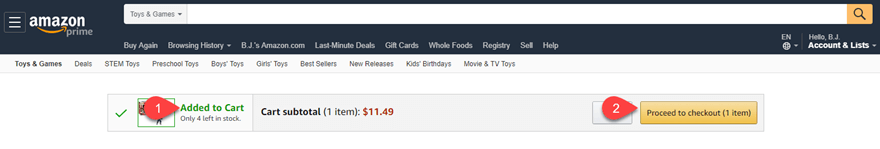
They will know exactly where they stand in the process, eliminating any ambiguity. This is especially important for mobile users, as screen real estate is at a premium.
04
Give Feedback
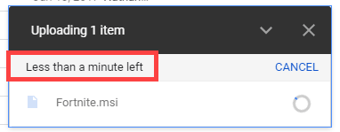
The last thing that users want is to not understand what is going on. If they press a button, provide an indication that the button was pressed. You can do it in multiple ways. You can animate the button, making it appear to sink into the page. Loading icons (like the MacOS Rainbow Wheel) provide feedback, “We are working on your request”, without having to say it.
If you allow users to upload files (such as with Dropbox or Google Drive), give an indication of time remaining. Provide a pop-up or modal that tells them their action was a success reduces frustration and confusion.
Really, whenever the user takes any action within your interface, just a small acknowledgment can be the difference in a good experience and a lackluster one.
05
Use Recognition, Not Recall

The opposite of good test-taking skills, you want your users to recognize everything about your site when they see it. They shouldn’t have to think about it and recall the information. More than anything, you are streamlining your interface so that every part is intuitive and moves from one point to another. This can be done by using recognizable icons as we mentioned above. People recognize certain icons for certain things.
It can also be done by using virtual tours to guide a user through a process, even when it’s not their first time. They will recognize the process once the first modal appears, and they won’t have to expend the energy recalling exactly how to perform those actions.
You may also be able to accomplish this through well-placed messaging that reminds your users of what on your site does what. We accomplish this in Divi with simple hover tooltips — even if someone doesn’t recall what the icon does, we lead them to its function. After that, they should recognize the icon. Or at least the tooltip if they hover again. Or even the process of hovering to get the information.
06
Choose How People Will Interact First

You know what’s the worst? Pushing on a pull door. Especially when you just pushed on a previous to get to that one. That building’s designer made the user interface inconsistent, so you had no clue how to do what you needed to do. What about pressing something that looks like a button that isn’t, but waiting for a response anyway? Well, that’s because those designers didn’t take into consideration how their users were going to interact with their product. So when you’re designing your UI, pick one movement (maybe two) and stick with it.
On mobile devices, that tends to be swiping. Look at Snapchat. Pretty much every single action is performed by swiping, including reaching your settings and profile. You can swipe down on Snapchat to see yourself, swipe left to get to the conversations, right to stories, and up to get to your memories (or whatever they’re being called this week). They chose how they wanted their users to interact with their product and designed their UI to accommodate that. Not the other way around.
When you’re designing your UI, choose if you’re going to use menus and taps, iconography, swipes and gestures, or something else entirely. Alexa and Siri use voice input as their primary UI interaction. The way they provide information and perform their tasks is designed around that particular input. And as a user, you know what to do intuitively because that information was set out for you at the beginning. The designers told you what to do, and you did it. Your users will appreciate you doing the same for them.
07
Follow Design Standards
The old saying if it ain’t broke, don’t fix it applies here. There really is no need to try to revitalize something if the standard works. That goes from icon usage to standard placement of elements. You don’t want to go against what your users expect things to do. People know that question marks (?) indicate help. So don’t use an exclamation point (!). If you want users to find your mobile menu, use the hamburger icon (the three stacked lines), not a grid.
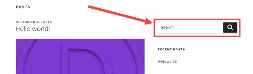
Think about search bars. They tend to be in similar places on most sites: the top of the sidebar or the end of the header menu. If not there, the center of the top section of the page. If you decide to include the only search field at the bottom of your sidebar, page footers, or beneath the text of your blog posts, folks won’t know where to look. Even if you identify it with the standard magnifying glass icon.
There’s nothing wrong with thinking outside the box and going for a new and innovative design, but that shouldn’t mean the design is hard to use.
08
Elemental Hierarchy Matters
No, we don’t mean that either Earth, Wind, Water, or Fire is the boss of the others. We mean that the elements on your page need to have a clear hierarchy for both utility and the way the user sees the page. Basically, you want to make sure that the most important functions are at the top of their respective pages. Additionally, this kind of hierarchy can lead the user down the page organically, leading the user through your service.
Large elements that decrease in size as you move through the process are indicative of importance and order. So does color and contrast. Making use of whitespace is also important, as clutter can stall user progress and draw the eye away from the purpose of the page. Clean lines, lots of space, and well-defined elements can visually indicate to your users how to move through your UI without any documentation or annotation.
A decent rule of thumb is that you want to keep things flowing from left to right, top to bottom.
09
Keep Things Simple
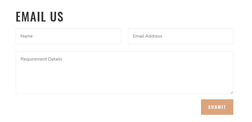
Look at this contact form:
Now look at this one:
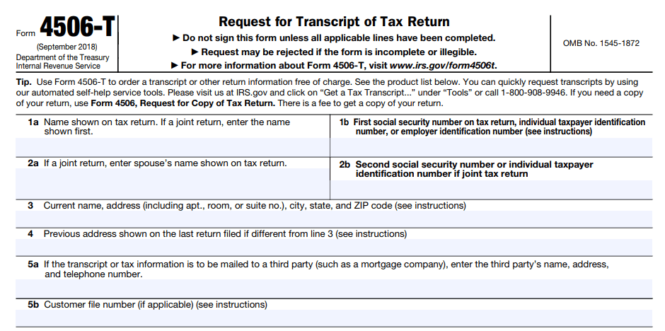
Both are contact forms to make a request. One of these is no problem to fill out, while the other is a bit more of a headache. Outside of being a government form, the design of the bottom form is not made for the user but for the administrator. That’s not your job. Your job is to make things as frictionless for the user as possible. And one of the best ways to do that is to cut out anything that’s not absolutely necessary.
10
Keep Your Users Free & In Control
The very last thing we want to touch on — and the very last thing you want to do with your UI — is taking control from the user. Or to make them feel confined or restricted by your design. You want to empower them, and your UI should allow them to perform the actions they want. There are two parts to this rule: context and permission.
First, whatever action the user needs to take should be located near what they want to act on. If they need to edit a post, the edit button should be near the save, publish/submit, preview buttons. In fact, the better option is for contextual menus for all of the actions the user can take on any particular item (or page). If you’re consistent in your UI, as we talked about above, your users will understand that these context menus or toolbars will always have the entire list of actions for any given element.
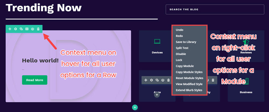
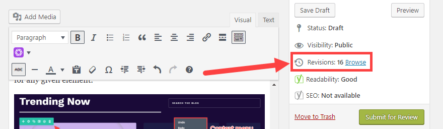
Additionally, your UI should always make the user feel as though they can get out of or revert any action they take. While you design the UI, they are going to be using it. So they need permission (or maybe even freedom) to do what they need to get the job done. Doing this can be as simple as adding a cancel button to every page of your ecommerce checkout (because pressing the browser’s back button may cause things to go haywire). Maybe it’s an undo feature so they feel that experimentation is okay. Or a revision history for large-scale projects (such as in Google Drive or WordPress or Git).
When your users feel free and unconstrained, you’ve obviously followed some good UI design principles.
UI-UX Strategy For App
Looking to boost sales in your business? Tried out all strategies you know but still cannot drive the traffic on your app? It’s time to reevaluate your website design and user experience. This is one of the most expository checklists of tips and tricks you can handout to your app developer. We know User Experience Design (or UX Design) is enhancing user satisfaction by escalating the usability, accessibility, and efficiency of user interaction with the website. As a UI & UX designer, your core task is to make a complex SaaS website or AI/ML integrated website easier to understand and user-friendly. There is no absolute prediction on which design trend will work best for your app project. It is an exhaustive list of points that make UI and UX of the website to make it a hit.
Here we are sharing 7 most probable winning tips and strategies for app UI designers and developers. Since without an excellent user interface, an application just cannot provide better user experience, UI and UX are interwind subjects.
01
Content
There’s no denying when it is said that content is still the king. However, the significance of content strategy in UI/UX design has started getting momentum recently. When it comes to user-interface (UI design), you can’t impress only with a fabulous design if the content is not impressive or complimenting the design. Similarly, when it comes to UX design, you cannot undermine the power of content strategy. Even if you bring the site to perfection, you’ll absolutely need engaging content in order to engage the user.
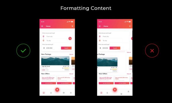
Ultimate tip: Always keep your content format in a way that is readable without any efforts to click, scroll or slide. The formating, either horizontally or vertically, should limit to a minimum.
02
Touch Gesture
You can enhance your user experience by creating touch gestures or controls. In UI/UX context, these controls can be added to graphical icons and visual representations that display elements and are used to add the input to the website. Here, by elements, we are talking about buttons, icons, lists, etc. By adding touch controls to these buttons and icons is that the user does not have to specifically learn how to work with it. It’s extremely simple.
03
Keep it really simple.
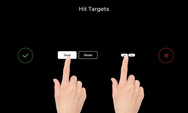
When it comes to interacting with UI elements like buttons, you need your users to get an idea that this button is ‘clickable’. Make buttons look like buttons. When we’re building a call-to-action button, it’s key role is to encourage the action of clicking but when your UI is boring or flat or too small to engage the audience, you subtract the chance of converting your visitors to leads.
04
Spacing And Font Size
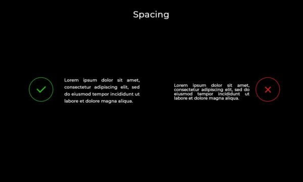
The proliferation of High Definition screens has wreaked absolute havoc on UI/UX designer. Having a great looking design and excellent functioning website is impossible without a well-designed text copy. Spacing and font size plays a major role in highlighting what part of copy should gain more visibility. As an app UI/UX designer, you must certainly know how to strategize your typography. For a great visual hierarchy, you can consider the following six points:
- Text scanning shapes are ‘F’ and ‘Z’. ‘F’ patterns are for text-heavy pages whereas ‘Z’ patterns are for other ads-like pages.
- Bigger text as titles.
- Use blank space around the buttons and other UI elements wisely.
- Bright colors are strong and stand out from the dull and muted colors.
- Text that is arranged on a curve or diagonal stands out against surrounding grid-locked text.
05
Contrast Play
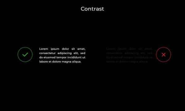
In UI/UX design, the contrast among font, color, and background becomes one of the winning elements. Designing for app-accessibility asks for building an overall experience for all users, regardless of their visual, hearing, motor, or cognitive ability. This is a unified approach where each element – color, font, and background should complement or contrast each other to create a look and feel for the users.
06
Make it engaging.
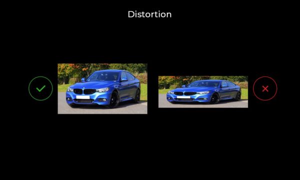
Going with the flow of technology advancement and compatibility browsers. Image size and resolutions play a fundamental role. Use the high resolution when it comes to adding images to your fantastic app project. The basic difference between high resolution and standard is very clear – a standard-resolution display has a 1:1 pixel density (or @1x), where one pixel is one point. High-resolution displays have a higher pixel density, offering a scale factor of @2x or @3x. Most JPEG files you use in your app can be compressed without noticeable degradation of the resulting image.
07
Imagery
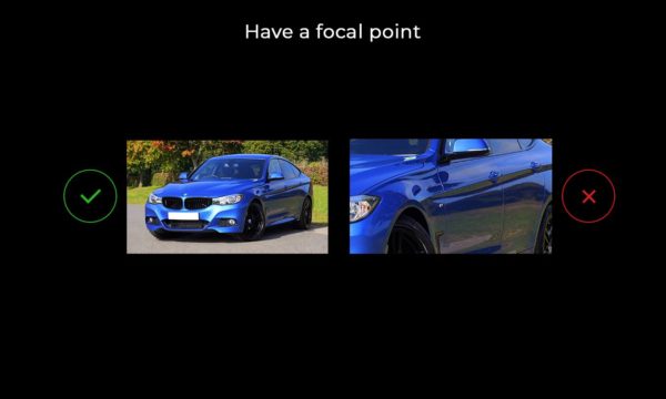
Human brains are accustomed to seeing structure, logic, and patterns. We perceive an image or interaction with any imagery by following theses parameters. The cognitive mind comprehends a certain picture after observing a certain set of elements and the context where they’re used. When it comes to using art in your fantastic app, make sure you’re presenting the image considering the main focal point. If it is about a feature you wish to highlight or if its about the button functionality, you need to set your imagery in the most optimized way.